Spring tulips watercolor painting

Spring is here and I am looking forward to the arrival of all of the beautiful tulips.

I tried something new last fall and planted a bunch of bulbs in large flower pots. They stayed in my shed over the winter and I brought them out last month. To my delight they are coming up now and it looks like I will have a bunch to enjoy. I can’t wait!

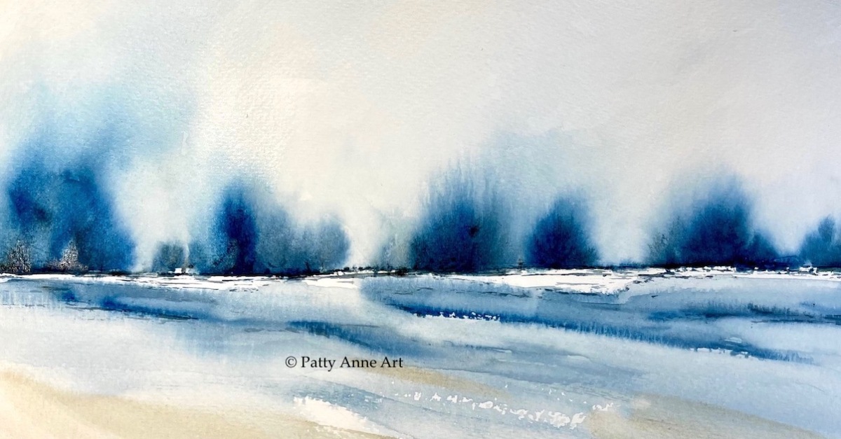
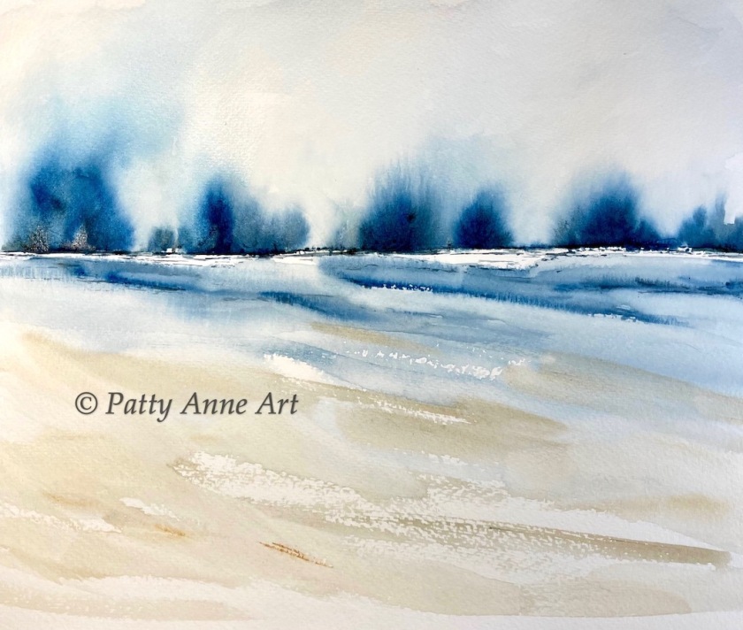
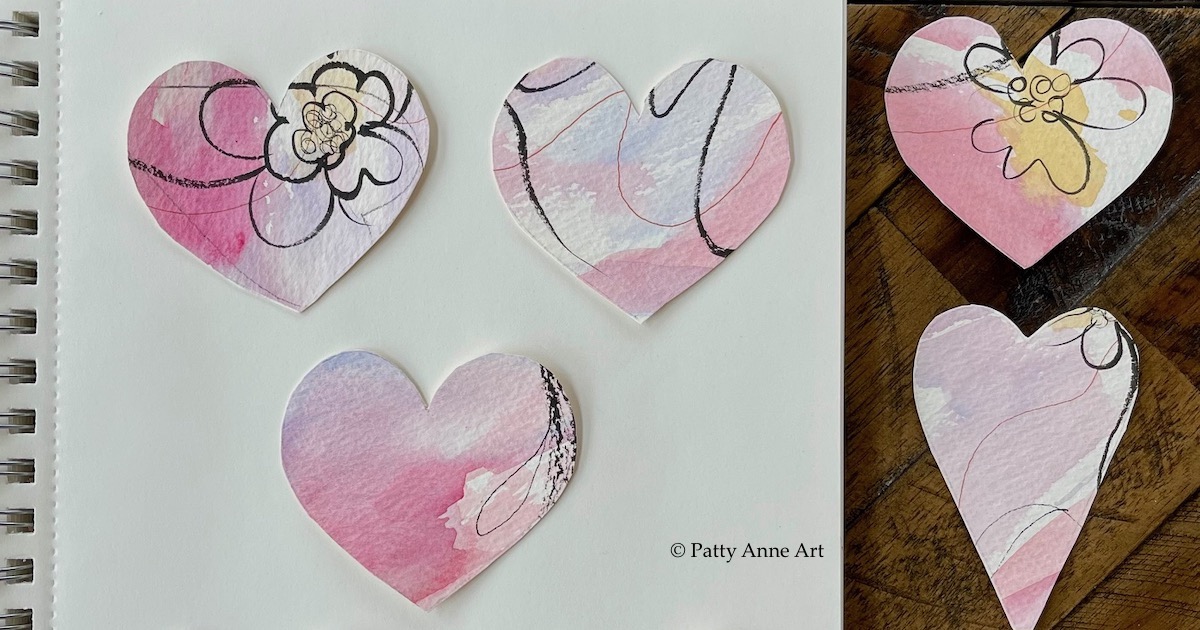
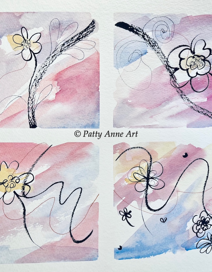
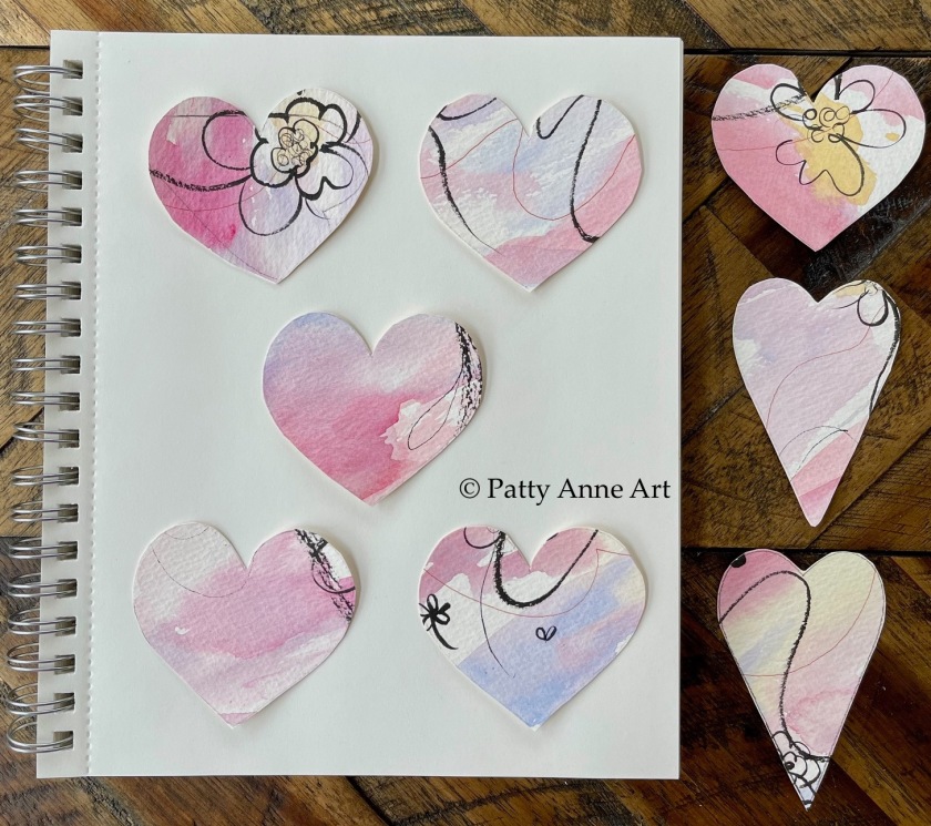
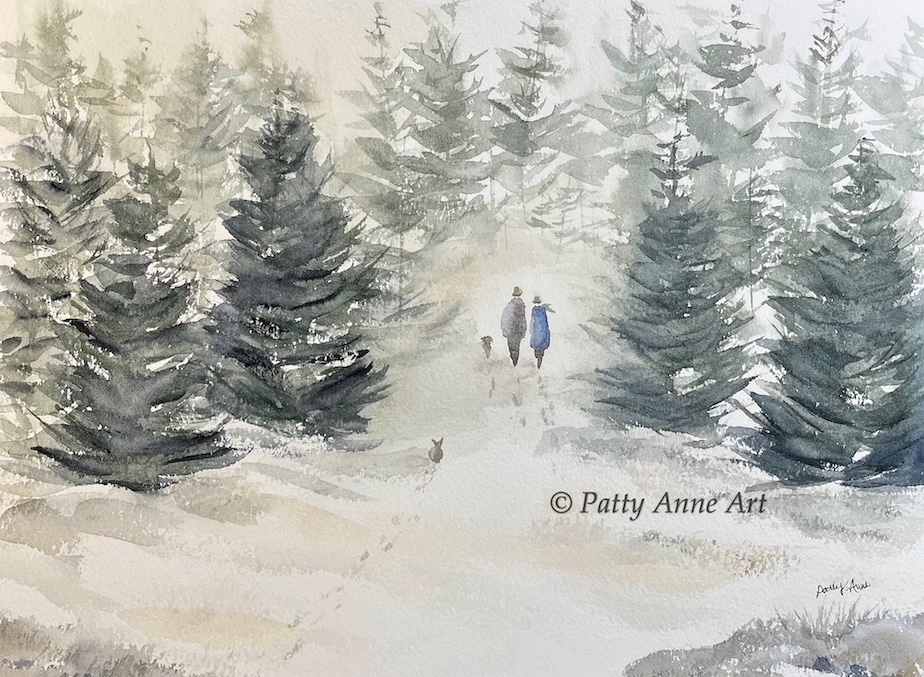
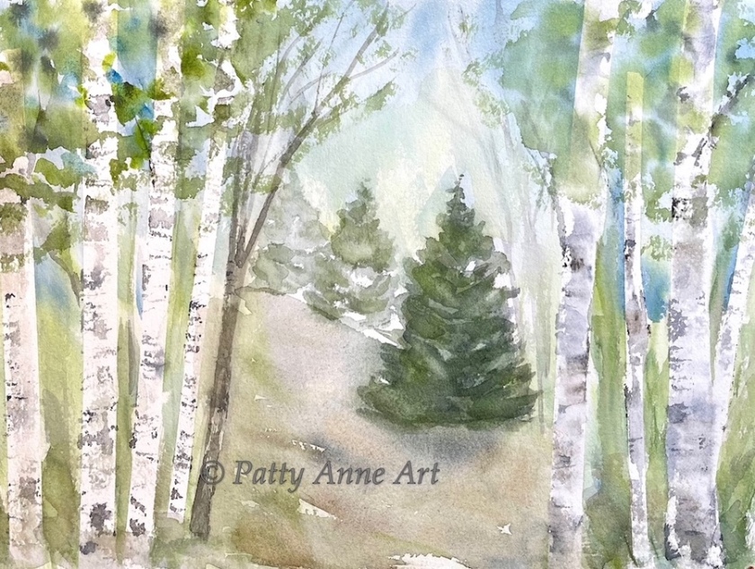
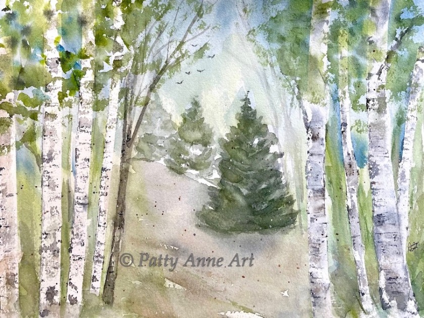
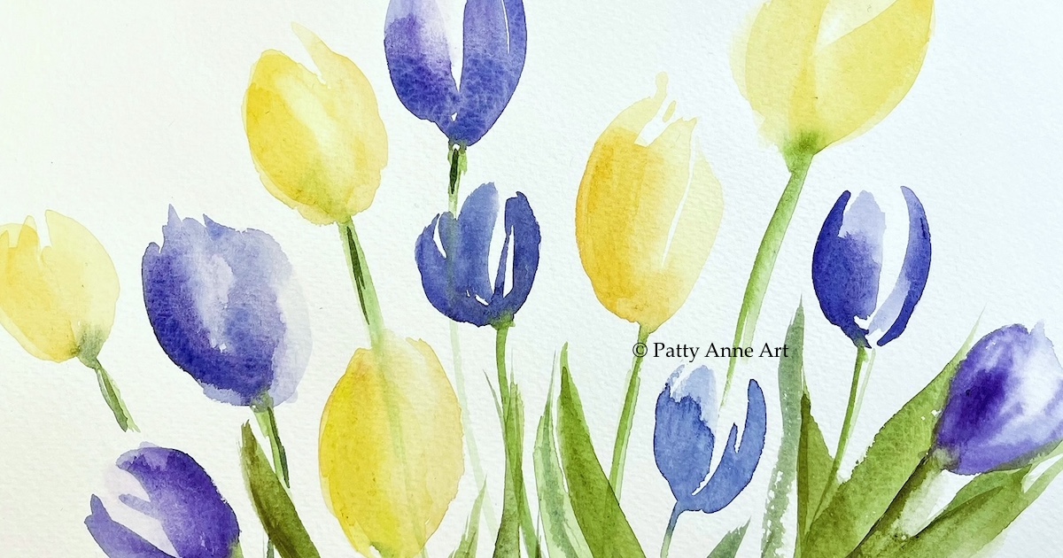
Speaking of tulips, I have a few in progress shots of a recent painting to share.

watercolor tulips painting - step 1

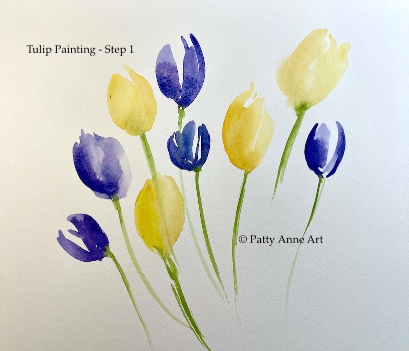
Starting out I added some simple tulip shapes with a just a few brush stokes for each. A large round brush worked nicely for this.

Watercolor tulips painting - step 2

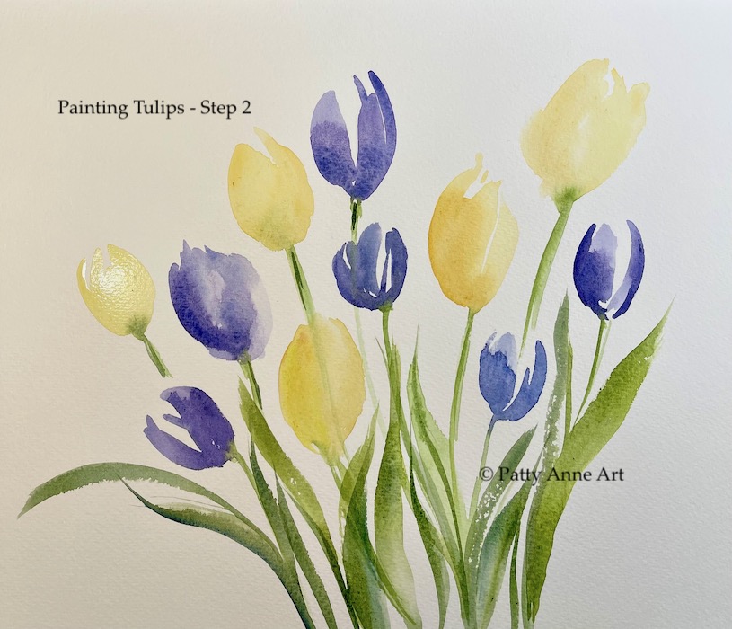
Adding some leaves and additional flowers here. Now the painting is starting to come together as the layering continues.

watercolor tulips painting - final step

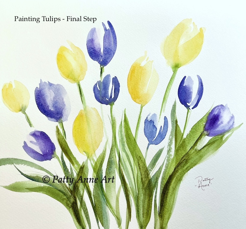
I arrived at this final composition. I really like the balance and movement as well as the pretty tulips.

Keeping it simple and fun was what this was all about. I hope you are inspired to create art and do something you love.

Until next time, share a smile and shine on.

Happy Painting!

Patty Anne ♡🌷

Landscape painting- creating a mood

Today I have a few landscapes to share. Each has a very different mood and feeling.

I love this quote:

“A painting requires a little mystery, some vagueness, some fantasy. When you always make your meaning perfectly plain you end up boring people”.
-Edgar Degas

Cool blue watercolor landscape

Cool Breeze landscape – 10 x 15 inch

The cool blues helped create this chilly seascape. I love the transition from the cool water bleeding into the warmer beach sand in the foreground.

Follow me landscape painting

Follow the leader – 7 x 10 inch

This painting feels dreamy to me.

Here the mood was created with muted color, carefree brush strokes, and layering. The pups are leading the way pulling you in.

At the coast watercolor landscape

At the Coast – 5 x 6 inch

I framed up a small landscape that I painted last year. It feels like summer walking to the beach. Looking at this little landscape brings me joy.♡

I love painting landscapes in different seasons and styles. Here we have three different scenes with very different moods. As you can see, the sky really sets the tone for a landscape.

Watercolor tips:
-I like to paint while standing. This helps me remain loose while painting.
-Music sets the mood. I like having some soothing music playing the the background.
-For carefree brush strokes think about how you hold your brush. Try loosening your grip and your wrist. Don’t overthink things, just relax and have fun.

I hope you are inspired to create art and do things you love.

Until next time, share a smile and shine on..

-Patty Anne 💚

Join me on Instagram @pattyanneart

Fun watercolor hearts project

I’ve been inspired by all of the fun valentine artwork online lately. Today I have a watercolor hearts project to share with you.

I started out with a mixed media abstract painting.

Mixed media abstract painting

Originally I planned to paint some small pieces for making cards. I played around making random marks with different types of pens and added various watercolors across the page.

wooden heart templates

At this point I decided on a hearts project. I used a few wooden heart templates for my shapes.

watercolor heart options

Here’s a view of the the hearts that I cut out. They are so cute, I love how they turned out! ♡

Framed hearts project

I played around with the layout and placement of the hearts in the frame. There are so many options and possibilities with this type of project.

I might try this again with different colors and maybe even different sized hearts.

I hope you are inspired to give this project a try. It was fun and super easy.

Until next time, share a smile and spread kindness everywhere.

Patty Anne 💜

Follow me on Instagram @pattyanneart

Winter walk – watercolor painting

Today I have a winter landscape that was inspired by a Karen Rice tutorial. I loved how she painted winter pines in a loose simple fashion. I decided to try that out.

winter walk watercolor - step 1

To create soft looking distant pines, I wet the paper with water first and painted with a light color mix. Moving forward I switched to a darker green mix and added a bit more definition on the branches.

Green watercolor mix:
Undersea Green
Payne’s Gray
Indigo

I planned to add a couple walking into the forest with their dog so I left an open area for that.

Winter walk watercolor - Part 2

Shading around the base of the trees was added next and it really made the snow come alive.

To add some warmth in the foreground, I added a few rocks and more warm tones.

Winter walk watercolor painting

The next step was adding the people which was a bit scary. I decided to go for it and paint them directly on the paper. I reassured myself by thinking, you’ve been practicing this a lot in your sketchbook and it will work out. And it did! 😀

I think the people and animals added another level of warmth and interest. I’m so happy with the way it turned out.

I hope I’ve inspired you create art and have fun. Thank you for following me on this creative journey.

Until next time, share a smile and shine on!

Patty Anne 💜

Follow me on Instagram at pattyanneart

Painting figures in my sketchbook

It feels like it has been a while since we had a quick sketchbook tour. I decided to work on figures again so let’s take a look at a few of them.

One of my goals has been to add more life to my paintings. Below is a warm up page where I am playing and loosening up. The hope is that with more and more practice I’m building confidence and achieving better results.

watercolor figures warmup

I just love to paint people in coats and scarves. Hats are fun too.

I added a few bunnies on the page as well, they are pretty cute.

Chilly walk watercolor

Chilly walk – 7 x 10 inch mixed media sketchbook

Another painting from my imagination. I started first by painting the people and the pup. Then I added the distant trees and foreground colors and shadows. I like that the green jacket really pops.

What I like about this style is that the figures lead you into the painting and you get to fill in the blanks as the viewer. A little mystery creates interest.

quiet beach walk

Quiet walk on the beach - 7 x 10 inch mixed media sketchbook

I used a different approach on this one. The beach landscape was painted first and then I added the figures after it dried. I was careful to think about the figures placement and size since they would be my focal point. A few distant people or shore birds on the beach might have been a good idea to add.

Everything was pretty loose and simple. Most of the landscape was painted with a large flat brush. I used a round #6 brush for painting the figures. A small liner brush was used to paint the distant birds and a few small details on the hill.

sketching sheep

Something different here. I sketched out a landscape scene with some sheep. A little planning before painting this time.

watercolor sheep in my sketchbook

I changed up the distant sheep in the actual painting. They probably should have been placed on the left to balance things out though. I guess that is a good note to remember if I repaint this one.

I do like how the sheep turned out and it was a fun practice. I’ll call that a win. 😊

I hope you enjoyed looking at a few pages in my sketchbook. Life has been busy but I hope to do more work in my sketchbook and show up more on my blog.

Wishing you all the best of season and a wonderful new year!

– Patty Anne 💚

Follow me on Instagram at pattyanneart

Painting trees – watercolor process

Today I have another painting that started with blocking out tree shapes using tape. I’ll share some in progress photos as I worked my way through this project.

I hope you enjoy seeing how my painting comes together.

watercolor trees blocked out with tape

I used washi tape and a strip of painters tape to mask off a some trees. A blue sky and green grasses went down next as a base layer of paint.

tree shapes revealed

And once it dried, off comes the tape.

It kind of looks odd at this point but fear not! Things will get better. 😉

beginning to add color to trees

I added color to the trees using a plastic card and watercolor brush. I didn’t want them to all be the same so I tried to vary the color and detail on each.

adding pines and detail

Some distant pines were added for more interest and depth. Notice that the one farthest away has less detail and color.

I decided to add a larger pine in the center as a focal point. It’s nicely framed by the birch trees.

I just wasn’t happy at this point and decided take a break. Overall things looked flat and cold. Time to rest and think about it.

addition of foliage and foreground

It needed more color and warmth. When I returned to my painting, I added some foliage to the trees. Right away it felt better and more alive.

The hill and foreground got my attention next. I wet the area with different colors letting the paint mix and mingle on the paper. While the paper was still wet, I dropped in more color and a few drops of clean water here and there.

In order to “ground” the trees in front, I pulled a tiny bit of brownish gray paint across the lower area to darken and dirty them up a bit. I think that worked well.

Between you & me watercolor landscape

Between you & me – 9 x 12 inch watercolor

Then some final touches to finish things up with more darks, distant birds, and a little splash of paint.

I hope you are inspired to paint, create, and have fun. Until next time, share a smile and shine on!

-Patty Anne 💚

Follow me on Instagram @pattyanneart

An October favorite

October seemed to fly by but then so does time in general. I didn’t paint or sketch as much as I would have liked. The first part of the month was very busy and then I was sick for the last few weeks.

Looking back, one painting from October stands out as a favorite.

Pines at the shore in progress watercolor

In progress – Pines at the shore

A simple composition, I started with the sky and distant hills first. Then I moved down to add a group of pine trees in the center area.

Pines at the shore watercolor painting

10 x 15 inch – Pines at the shore

I completed the painting with more detail on the pines and added a simple foreground with a few branches off to the side.

What I like about this painting:

  • I painted a little larger than my normal size and the composition still feels balanced. yay!
  • Nice texture in the foreground using wet on dry technique, dragging the brush across the paper.
  • Lovely shades of green on the pines with some nice dark areas.
  • Distant hills added interest and depth.

    I hope you are inspired to create art and do something you love.
    Take good care of yourself.

    Thanks for stopping by.

Patty Anne 💚

Join me on Instagram at pattyanneart

Birch trees – watercolor painting process

I recently painted a lovely little watercolor landscape of birch trees. I captured some in progress photos to share with you.

Hope you enjoy! 💚

I started in my mixed media sketchbook by using washi tape to mask out some trees on the blank page.

Next I worked on the background adding a sky and grasses. This part was loose and fun. The goal was to get some watercolor down on paper and not think too much about it.

You can see some of the paint was puddling on top of the tape so I gently wiped that with a tissue. Then once the background dried, I carefully removed the tape.

At this point I started painting the trees using a plastic card and tiny brush. I mostly used neutral mixes of light gray to swipe color across the tree trunks in random places. Once the trees were completed, I added a few tiny branches using a small liner brush.

As I continued on, I added some shading on the left side of the trees and added more foreground color and grasses. I was pretty happy with the sky and trees at this point but wanted to add some foliage at the top. The foreground also needed some more work but things were really starting to shape up.

I added some color for leaves at the top and really like how that worked out. A little something and nothing while trying to not overwork it. Final step was the addition of more grasses, a tiny bit of spatter, and a little white ink for highlights.

I love these colors and hope to try a larger version of this one. I hope you are inspired to give this a try and have fun with it.

Until next time, share a smile and sprinkle kindness everywhere.

Happy Painting!

Patty Anne 🧡

Join me on Instagram at pattyanneart.

Cosmos Sketch

I’ve enjoyed caring for the beautiful Cosmos flowers in my garden this summer. I planted them from seed and watched with delight as they grew and grew. It was pretty exciting when they finally started to bloom.

Golden hour photo taken with my iPhone. 🌸♡

These beauties have been blooming for months. I’ve been snipping the spent flowers and it’s amazing how quickly new buds are produced.

This quick sketch was done using a large shading pencil (a mega graphite 6B). I think the fat pencil helped me keep it loose and carefree.

I hope you are inspired to create art and do something you love.

Until next time, share a smile and shine on!

Patty Anne 💚

Join me on Instagram at pattyanneart

A few more painting experiments

Today I have a few more landscape experiments that I worked on over that last month. It’s been a fun way to explore and develop skills.

I used a 12 x 12 inch piece of Fluid watercolor paper and divided it into four areas using a pencil.

beach underpainting

I used a limited palette of neutral colors in the underpainting. Then in each of the four cells, I painted a different landscape scene.

Two small watercolor landscapes

The beach was a recurring theme but I tried to make each painting a bit different.

Four - small landscapes

One thing I found in this experiment was that I didn’t fuss much with the sky. I think the payoff was a fresher look. I like the imperfections and happy accidents going on there.

beach path watercolor

Closeup view of the beach path with a moody sky

Below are a few more landscapes from another set of painting experiments.

beach walk watercolor

Notice this beach path feels very different from the one above. The bright blue sky and overall light gives it such a happy summer feel.

beachy blues watercolor

This painting has a soft background with some pretty beach grasses in the foreground. I’m loving the something and nothing there. A little scraping with a plastic card created some nice light areas and texture.

** Baby update! My sweet grandson arrived earlier this month. Mom and baby are doing well. ❤️ Our family is overjoyed with this precious little one.

I hope you are inspired to create art and do something you love. Until next time, share a smile and shine on.

Patty Anne ♡

Join me on Instagram @pattyanneart